When most people pick up a deck of cards, they’re thinking about the game. Poker face ready, snacks at the table, maybe a bit of friendly trash talk. But if you take a moment to flip a card over, you’ll find something quietly fascinating: the artwork on the back. The art on playing cards, especially in the UK, has a history just as rich and detailed as what’s going on up front, and, dare I say, sometimes even more stylish.
Back in the day (we’re talking 15th century), cards arrived in Britain via Europe, and their backs? Well… they didn’t have any. Cards were either plain white or covered in a bit of coloured paper – purely functional, with zero flair. But by the 1800s, as printing techniques improved and British makers like De La Rue entered the scene, everything changed. Suddenly, the backs of cards weren’t just blank space, they were a canvas. And not just for beauty, either. A patterned back could hide wear and smudges, stop players spotting cards in strong light, and prevent sneaky marking. Practical and pretty.
Fast forward to Victorian Britain, and the backs of playing cards became downright elegant. Paisley swirls, floral arrangements, scrolling vines – it’s like the cards were wearing wallpaper from a stately home. These weren’t random choices either. The Victorians were big on symbolism, and paisley, which came from Persia originally, was thought to represent life and eternity. Cheeky little designs with deep meanings, hiding in plain sight. Some cards even had commemorative backs – think royal coronations or major events like the Great Exhibition. Yep, even your deck of cards could get in on the national celebration.
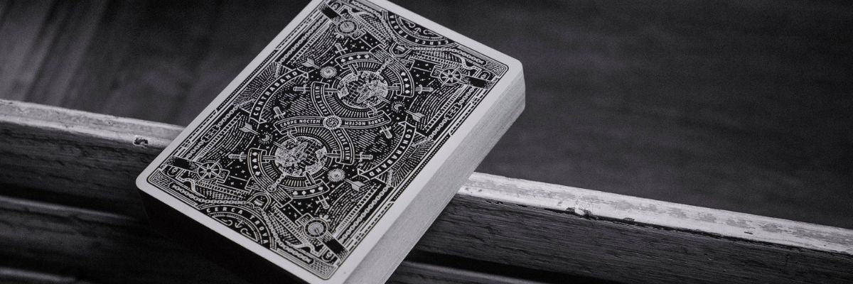
One thing you'll notice with premium playing cards is how beautifully symmetrical the backs are. That’s no accident. In the late 1800s, Charles Goodall & Sons helped introduce double-headed court cards – so the King of Hearts wouldn’t look upside down if you flipped him. Naturally, the back designs followed suit (pun very much intended), using symmetrical patterns to avoid giving away orientation. Anything too one-sided was a dead giveaway in serious play. Symmetry became the gold standard – part artwork, part anti-cheating device.
Now and then, UK decks still threw in some one-way designs. Souvenir decks might have a scenic view, a royal portrait, or even the Union Jack plastered across the back. Not ideal for a poker night, but great as keepsakes or collector's pieces. And sometimes the backs got sneaky – during WWII, escape maps were hidden inside cards, peeled apart by POWs. Actual espionage in your deck. Who knew?
UK manufacturers really left their mark here. Thomas De La Rue, Waddingtons, and Goodall created hundreds of back designs between them, ranging from detailed arabesques and guilloché patterns to themed artworks like Shakespearean characters or political satire. Waddingtons, in particular, nailed the traditional British look – small, tightly packed patterns in deep reds and blues. Flip over a modern Waddingtons card and you’ll still see echoes of those classic designs.
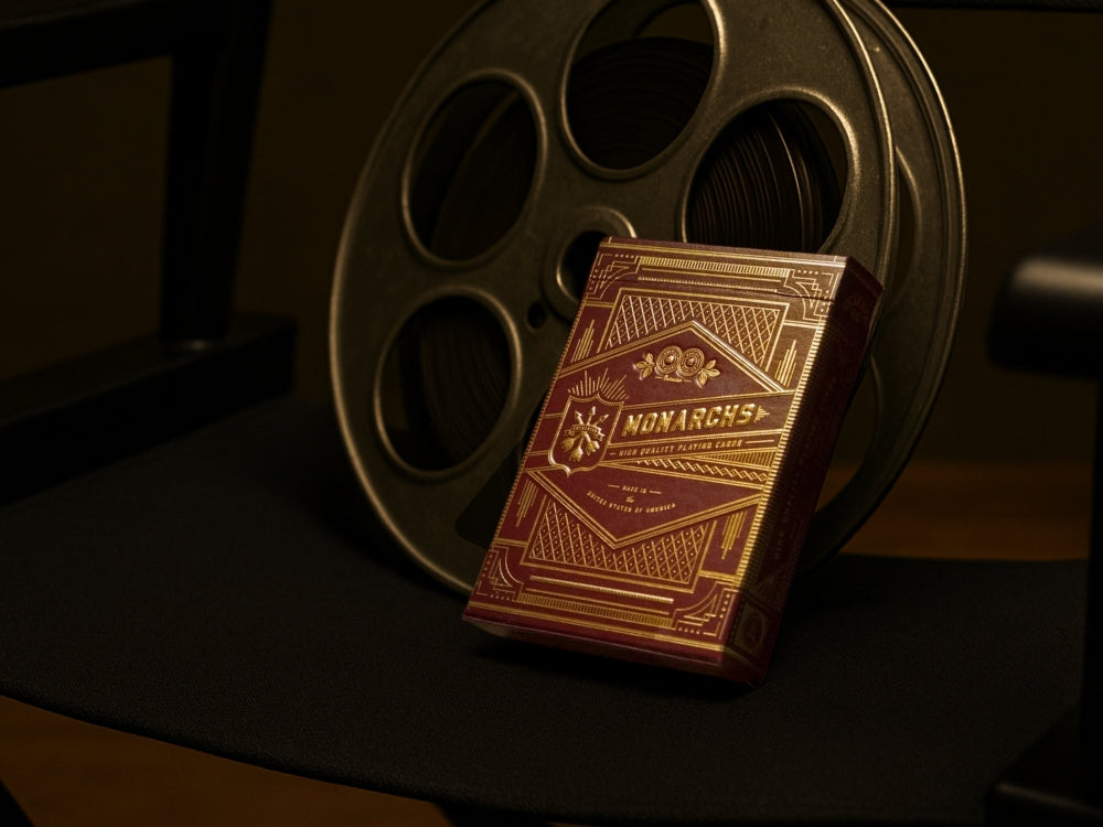
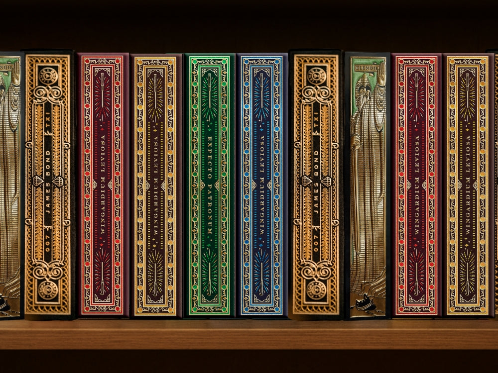
Of course, we’ve come a long way since vine leaves and royal crests. Playing card artwork today ranges from the timeless to the totally wild. Theory11 playing cards have raised the bar when it comes to luxury playing cards, with back designs that feel like something out of a Bond movie. Their Monarch playing cards are a perfect example – intricate gold foil details, deep green elegance, and a richness that makes you want to shuffle them slowly just to admire the art. They're not just for playing – they’re for showing off.
And then you’ve got the Basquiat playing cards, where the backs and faces are literally works of modern art. The raw brushstrokes and bold symbolism of Jean-Michel Basquiat aren’t toned down – they’re splashed all over the cards, turning gameplay into an art gallery moment. Compare that to something like High Victorian playing cards, also from Theory11, and you’ll see how varied the world of card backs has become.
Themed decks like Marvel playing cards manage to strike a balance between fan service and visual flair. Whether you're team Iron Man or Captain America, there’s a back design for you, and it’s usually packed with sleek lines, heroic symmetry, and clever nods to the comics.
So is there a connection between the front and the back of the cards? Sometimes. In traditional decks, not really – the court cards follow the English pattern, while the backs were more about aesthetics or brand identity. But in themed or commemorative decks, like the Lord of the Rings playing cards, the backs and fronts are often part of a visual package – same world, same vibe, just different sides of the coin.
Art on playing cards has gone from being a way to cover up smudges to a form of self-expression, storytelling, even luxury branding. Whether it’s a centuries-old floral pattern or a bold modern splash of colour, the art on playing cards is part of what makes them so collectible – and so addictive. You’re not just buying a deck of cards. You’re holding a little piece of design history in your hands.
Playing cards aren’t just for passing time. They’re a pocket-sized gallery, centuries in the making.


